Case Study
DSA Visualizer – Interactive Data Structures & Algorithms Platform
01 — Context & Motivation
This project emerged from a gap I identified while preparing for technical interviews. Most existing DSA resources, such as NeetCode-style roadmaps, present problems as flat lists or strictly linear progressions. While useful for coverage, this format made it difficult to visualise the overall scope of the domain or understand how individual problems and algorithmic patterns relate to one another. I often found myself with a narrow, tunnel-vision view of preparation, unsure where I was positioned within the broader landscape of problems.
In practice, effective preparation required two elements that were consistently missing: a visual representation of the problem space as a whole, and a pedagogically structured progression that balanced new material with deliberate revision. Rather than optimising for speed or sheer volume, I wanted a system that made conceptual relationships explicit and reinforced long-term understanding through structure. The DSA Visualizer was built as an exploration of that idea.
02 — System Architecture
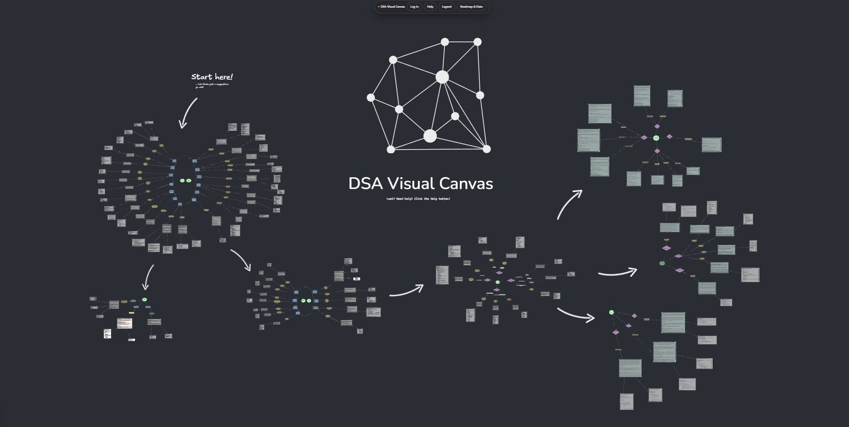
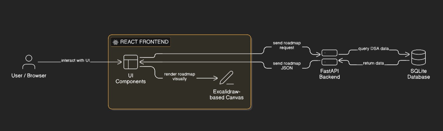
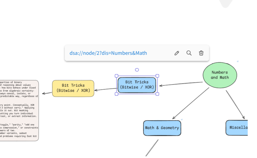
The platform consists of a React-based frontend paired with a FastAPI backend responsible for generating personalised study roadmaps. The frontend is built on top of a forked, self-hosted Excalidraw canvas, which provided a flexible, free-form surface for spatially arranging algorithmic concepts. This choice allowed rapid iteration on visual layout while avoiding the overhead of building a custom renderer from scratch at an early stage.
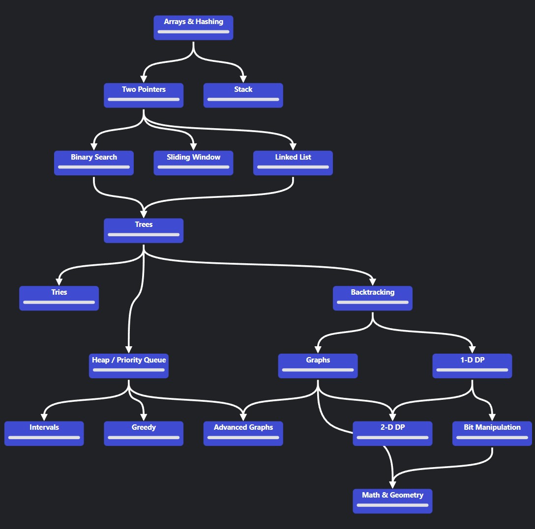
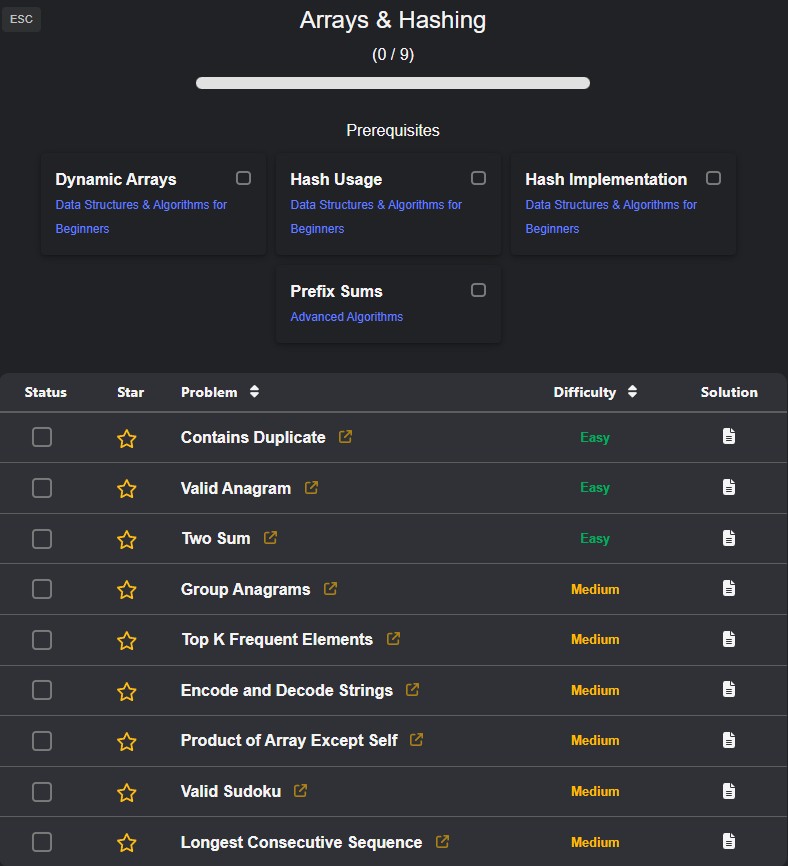
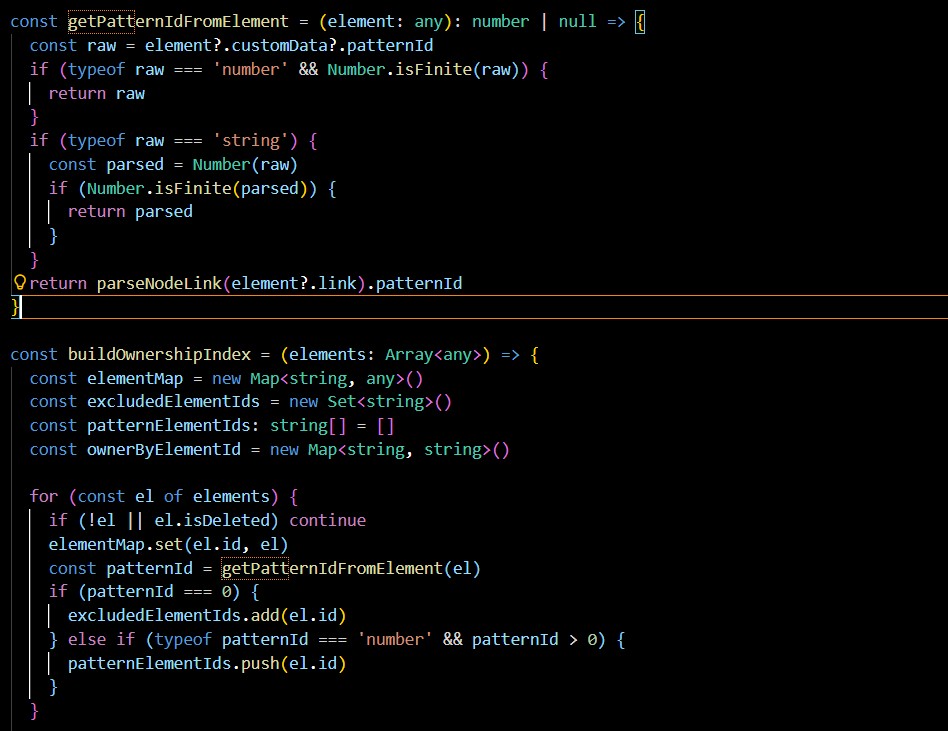
Algorithmic problems are stored in a structured SQLite database. Rather than acting as simple storage, the database encodes explicit relationships between categories, patterns, sub-patterns, and difficulty tiers. The backend queries this schema and transforms the results into a graph-oriented representation describing both conceptual relationships and recommended study order.
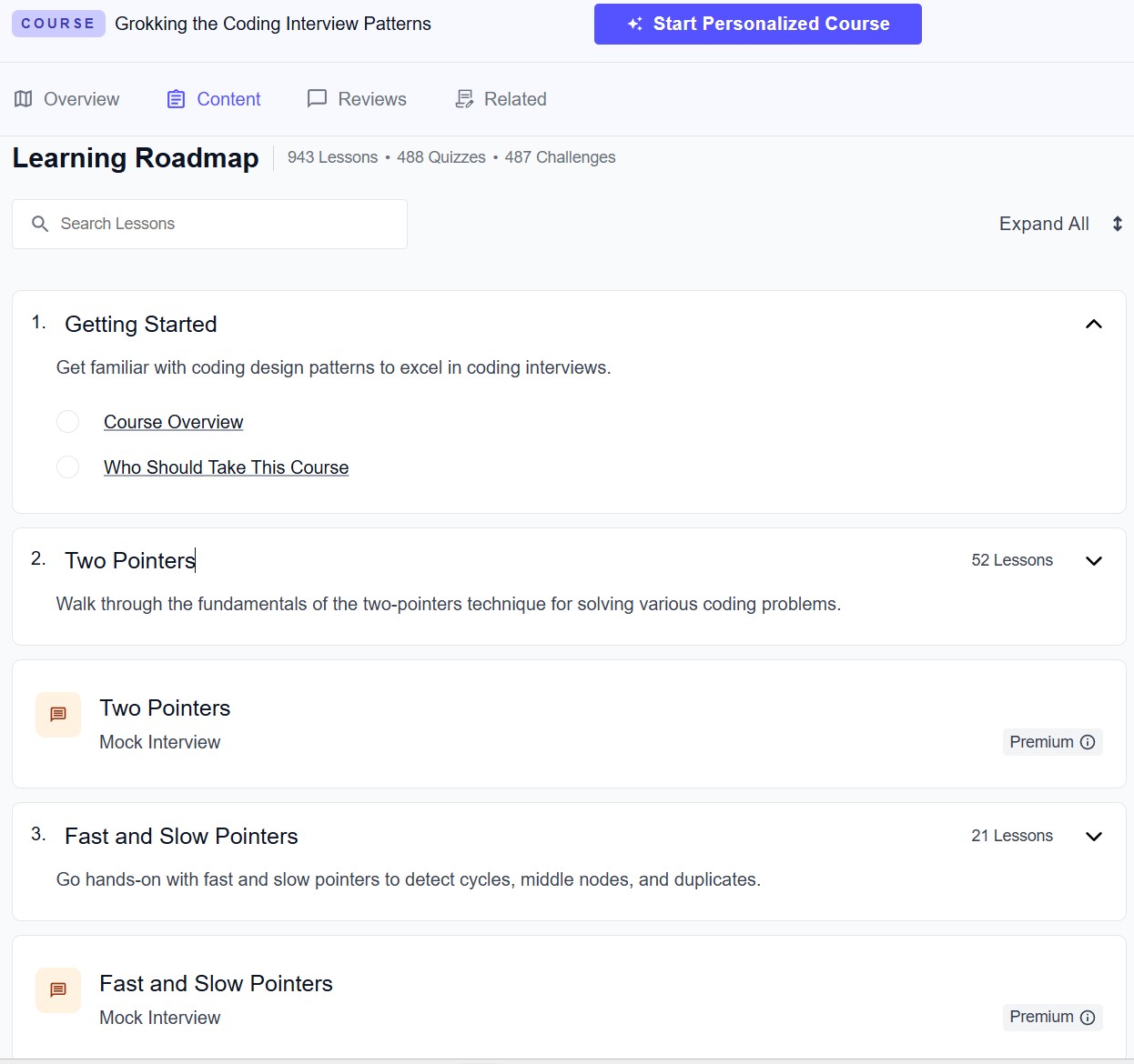
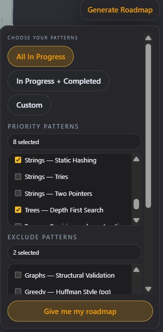
The backend exposes an API that accepts user-level inputs and produces a deterministic roadmap output, including ranked problem clusters, revision intervals, and pattern associations. This output is consumed by the frontend and rendered as an interactive canvas, where nodes represent algorithmic concepts or problem groups and edges represent relationships or progression.
The system is intentionally separated into three layers: persistent structured data, roadmap generation logic, and visual presentation. This separation made it possible to experiment with heuristics and ranking strategies without tightly coupling them to the UI, and it kept the frontend focused purely on interaction and presentation rather than decision-making logic.
03 — Key Design Decisions
The core design decision did not begin as a formal architectural choice, but as a practical workflow. I was already organising my own DSA preparation as a hand-crafted canvas, manually grouping patterns and annotating relationships. The project emerged naturally from the desire to automate that process and attach concrete LeetCode-style problem sets to the conceptual structure I was building visually.
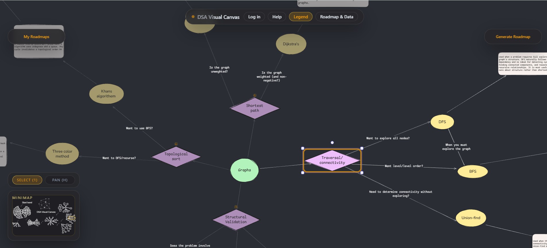
A canvas-based visualisation was therefore chosen over a traditional list or tree. Unlike linear roadmaps, a canvas makes both breadth and depth visible at the same time, allowing concepts to be spatially grouped and repositioned as understanding evolves. This directly addressed the tunnel-vision problem I experienced with existing resources and made it easier to locate myself within the full family of algorithmic problems rather than a single track.
On the backend, SQLite was treated as a structuring tool rather than a passive datastore. Designing a relational schema that captured category, pattern, sub-pattern, and tier relationships forced clarity about how problems should be grouped, queried, and ranked. This schema shaped the API contract itself, ensuring the frontend received data already organised for graph construction rather than requiring ad-hoc client-side processing.
Roadmap generation was deliberately centralised in the backend. Weighting, tiering, frequency analysis, and revision scheduling are all applied server-side, producing an inspectable and reproducible roadmap. This allowed rapid iteration on heuristics while keeping the UI logic simple and predictable.
04 — What Works Well / Trade-offs
The backend logic proved more robust than initially anticipated. In particular, using a union-find–style approach to group related patterns allowed the roadmap to reflect conceptual cohesion rather than arbitrary ordering. Applying a classic data structure in a non-textbook context became a highlight of the project. In that sense, the system became a meta-project: it created a practical space to apply algorithms I was learning academically to a real, user-facing problem.
The visual roadmap communicates scope and structure in a way that static lists or book chapters cannot. Users can quickly identify which areas cluster together, which concepts they have already covered, and where revision is required. This makes the system useful not only as a planning tool, but also as a reflective aid during preparation.
There are trade-offs on the frontend. Using a general-purpose canvas abstraction such as Excalidraw enabled rapid prototyping, but fine-grained interaction control required workarounds. Features like right-click actions, highlighting, and metadata-driven behaviour were implemented by embedding structured metadata directly into visual nodes. While effective—and an enjoyable technical challenge given the constraints—this approach increased complexity and made certain refinements harder than they would be in a bespoke rendering system.
05 — Future Improvements
A natural next step would be to replace the generic canvas layer with a bespoke renderer designed specifically for algorithmic graphs. This would allow cleaner separation between data and interaction logic, improved performance for large roadmaps, and more precise control over visual affordances such as grouping, emphasis, and revision indicators.
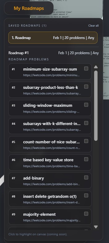
Further improvements would include user authentication, persistence of generated roadmaps, and richer customisation of heuristics. Storing user-specific roadmap states and completed problems would enable tighter feedback loops between progress tracking and roadmap regeneration, building directly on the existing architecture without requiring fundamental redesign.